
Overall Design Process Infographic
Setting the Stage: Streamlining the Clock In/Out Experience
This case study dives into the design process of a mini-app for Walmart, specifically focused on improving the clock in/out experience for hourly associates. These associates rely on this functionality to accurately record their work hours and ensure they receive appropriate compensation, including paid and unpaid breaks.
1. The Starting Point: Analyzing the PRD
Similar to most major organizations, Walmart’s design process begins with a Product Requirements Document (PRD). This document serves as the foundation, often linked within the initial intake form submitted by a Product Manager to the UX team.
As a UX Manager (in this case, myself), I review both the intake form and the PRD. The PRD typically outlines the project’s final delivery date. My role then involves delving into the project’s specifics, analyzing its intricacies, and forming a preliminary assessment of resource allocation needed to complete the product within the specified timeframe.
2. Challenges in the Initial Requirement (PRD):
2.1 High-Level Overview:
Often, product requirements begin as broad outlines, lacking in-depth exploration of every possible scenario.
2.2 Living Document Approach:
The “living document” nature of PRDs can sometimes lead to a lack of complete information at the outset, including:
- Process Maps: Detailed visual representations of the user journey may be absent.
- Roadmaps: Clearly defined product roadmaps outlining future development stages may be missing.
- Concrete Problem Statements: Specific and actionable descriptions of the problems being addressed may be unclear.
2.3 Encountering these challenges:
My experience mirrored this scenario. The initial PRD presented several issues:
- Generic Problem Statement: The problem statement lacked specificity, making it difficult to grasp the core challenges.
- Limited Scenarios: Few user scenarios were provided to understand the context of use.
- Legacy System Reliance: Only outdated screenshots of the existing system were available, without any usability testing data.
- Absence of Process Maps: No process maps outlining the current workflows were provided.
- Mobile App Focus: The sole directive was to replace the legacy system with a mobile app usable within a defined geofenced area.
- Undefined Success Metrics: The document lacked any established metrics to gauge the app’s success.
3. Initiating User Research:
The PRD’s limitations became evident from the outset. It became clear that a comprehensive user-centered approach, following the Triple Diamond method, would be crucial for project success.
3.1 Diving Deeper:
To uncover potential hidden complexities, I assembled a team consisting of myself, the UX design team, and the UX research team.
3.2 Inclusive User Selection:
In collaboration with the product team, we identified users representative of diverse demographics:
- Age Groups: Varied age ranges to capture generational perspectives.
- Locations: Users from different geographic regions within Walmart’s operations.
- Experience Levels: Users with varying years of experience with Walmart and the legacy app.
3.3 Unveiling User Needs:
I employed a two-step interview process:
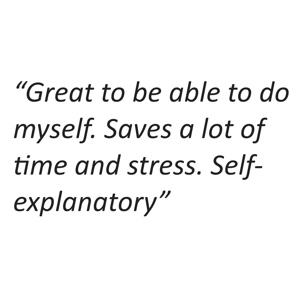
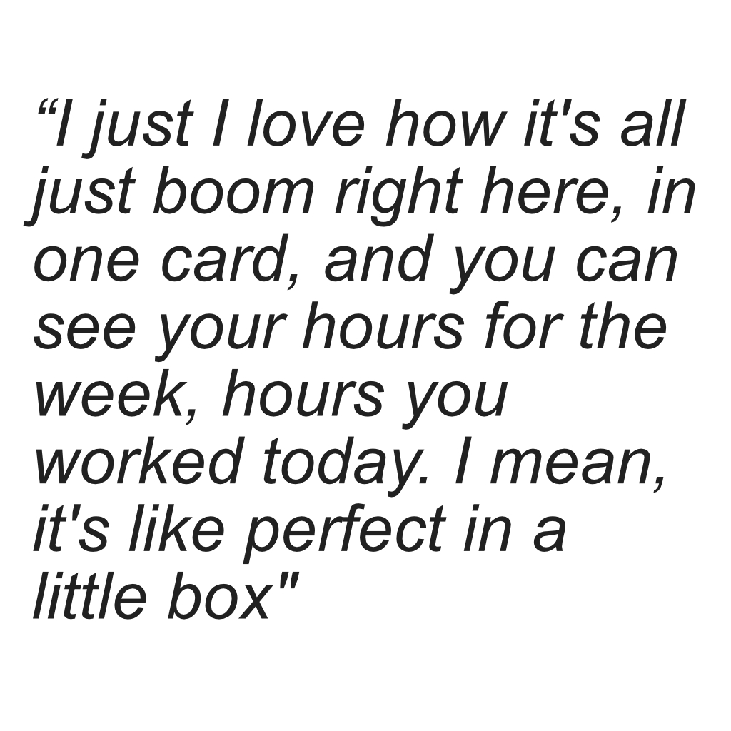
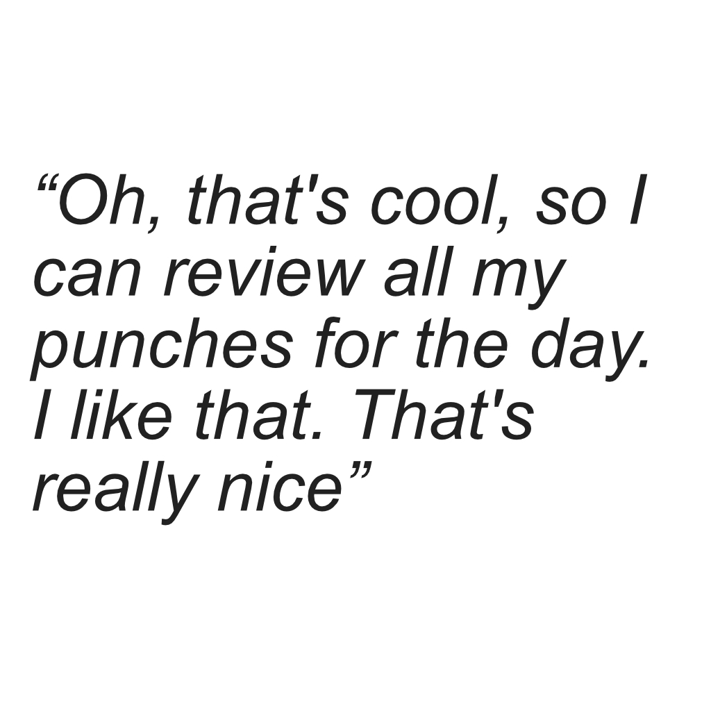
3.3.1 Open-Ended Inquiry (3-4 Interviews):
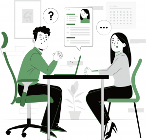
- Pain Point Identification: We focused on uncovering user frustrations and challenges.
- Ideal State Exploration: We explored user aspirations for a perfect mobile app experience (“north star view”).
- PRD Validation: We assessed if the identified issues in the PRD mirrored real user pain points.
- Scenario Mapping: We encouraged users to share all conceivable clock-in/out scenarios encountered in their work experience.
This image shows notes taken from several interviews conducted using open-ended questions
3.3.2 Qualitative and Quantitative Validation:
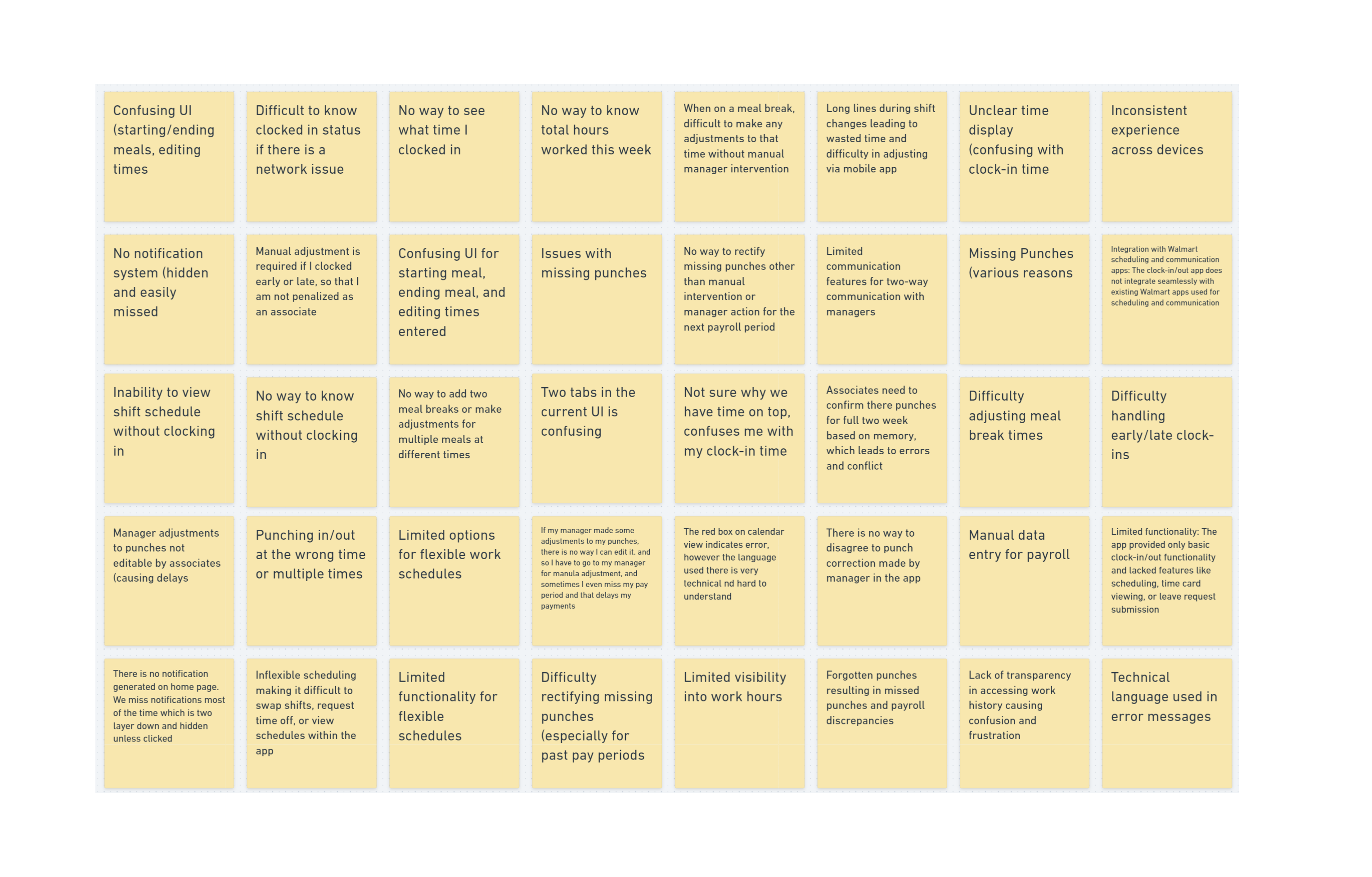
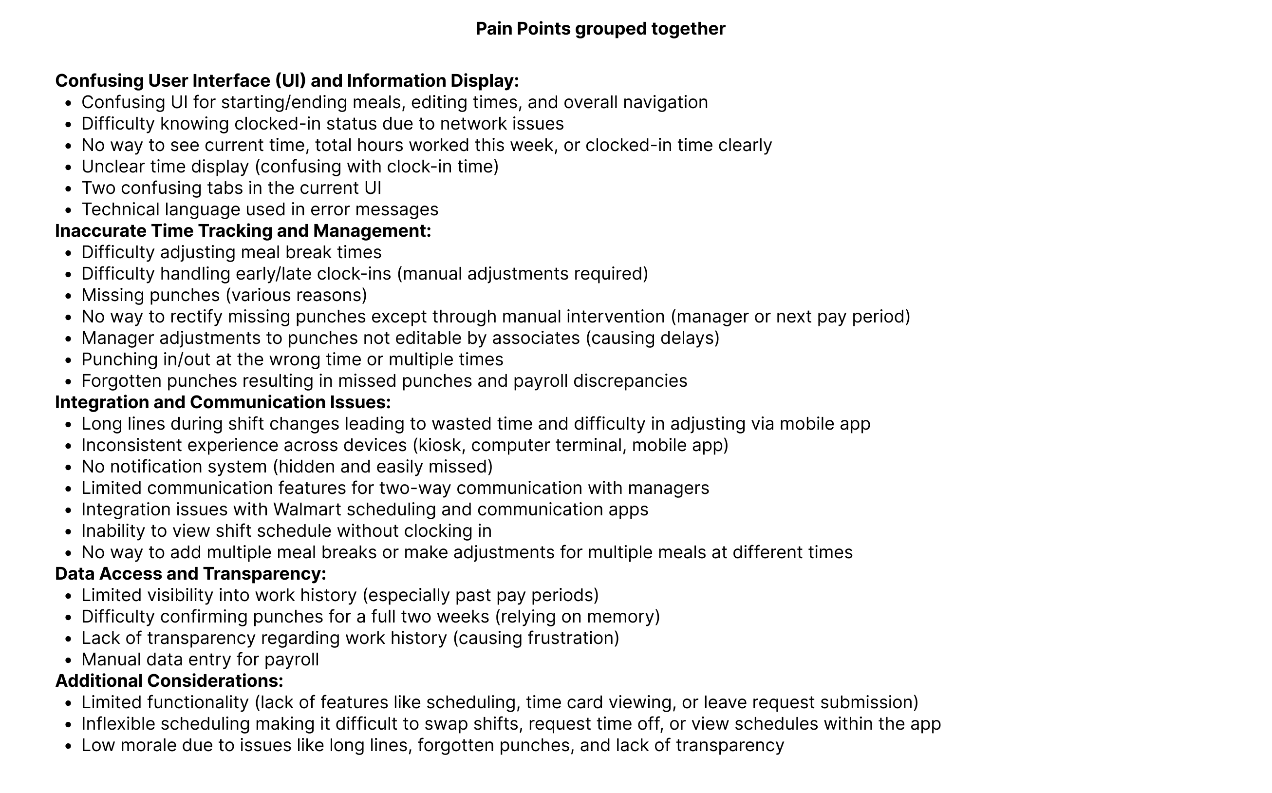
- Pain Point Compilation: We consolidated pain points from all interviews.
- Card Sorting: Similar pain points were grouped using card sorting techniques.
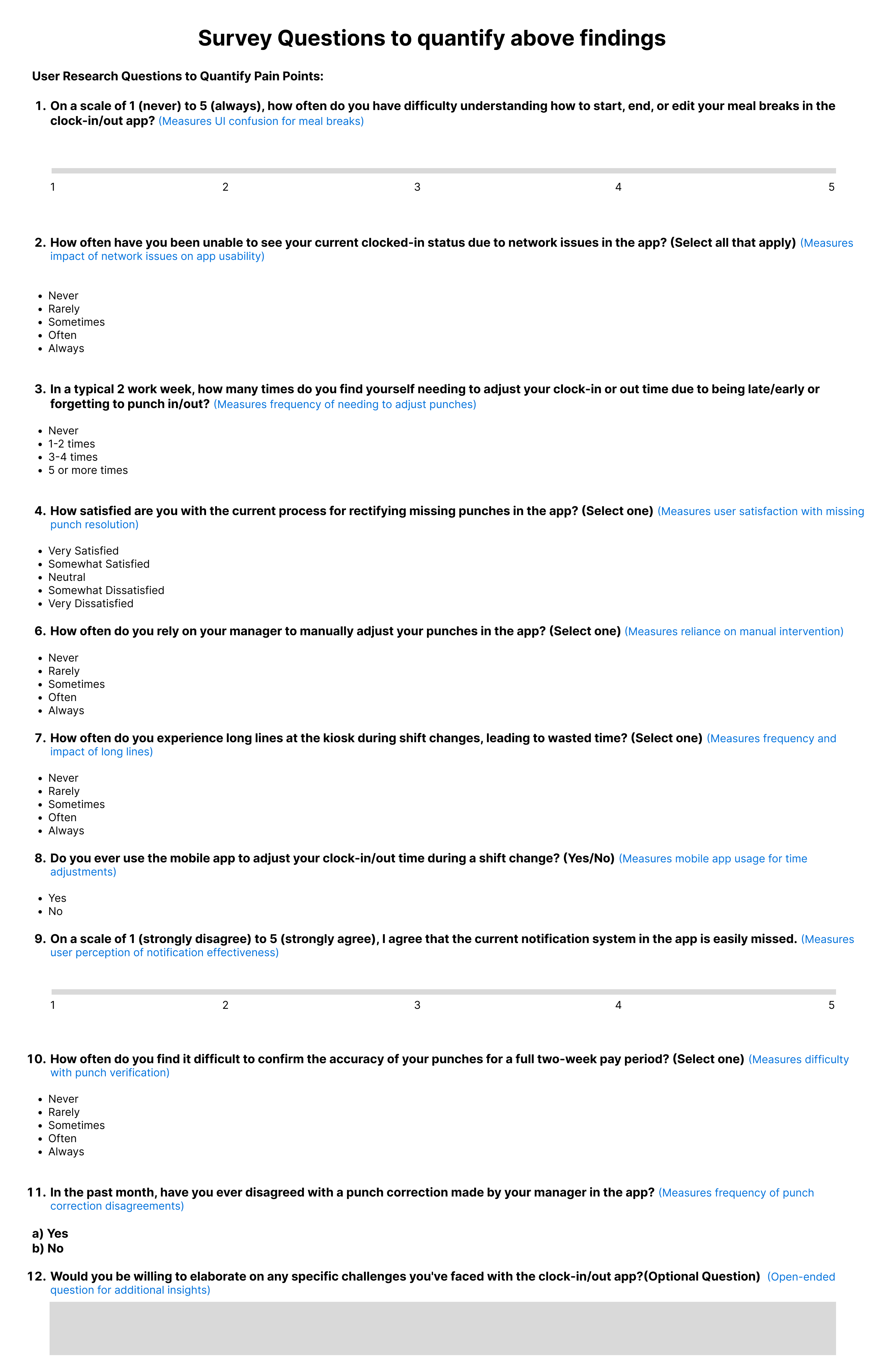
- Survey Refinement: We conducted a survey with a broader user pool to:
-
- Quantify Severity: Users rated the severity of each pain point.
- Prioritization: Users ranked pain points based on importance.
-
- Methodology Integration: We utilized a qualitative approach to identify potential pain points and hypotheses, followed by a quantitative approach to validate these hypotheses and establish priorities.
3.4 Outcomes:
Through this comprehensive research process, we achieved significant results:
- Comprehensive Pain Point Identification: We uncovered a vast majority of user pain points.
- Prioritization Framework: We established a user-centric hierarchy of pain point importance.
- Unveiling Edge Cases: We discovered and understood even the most extreme user scenarios.
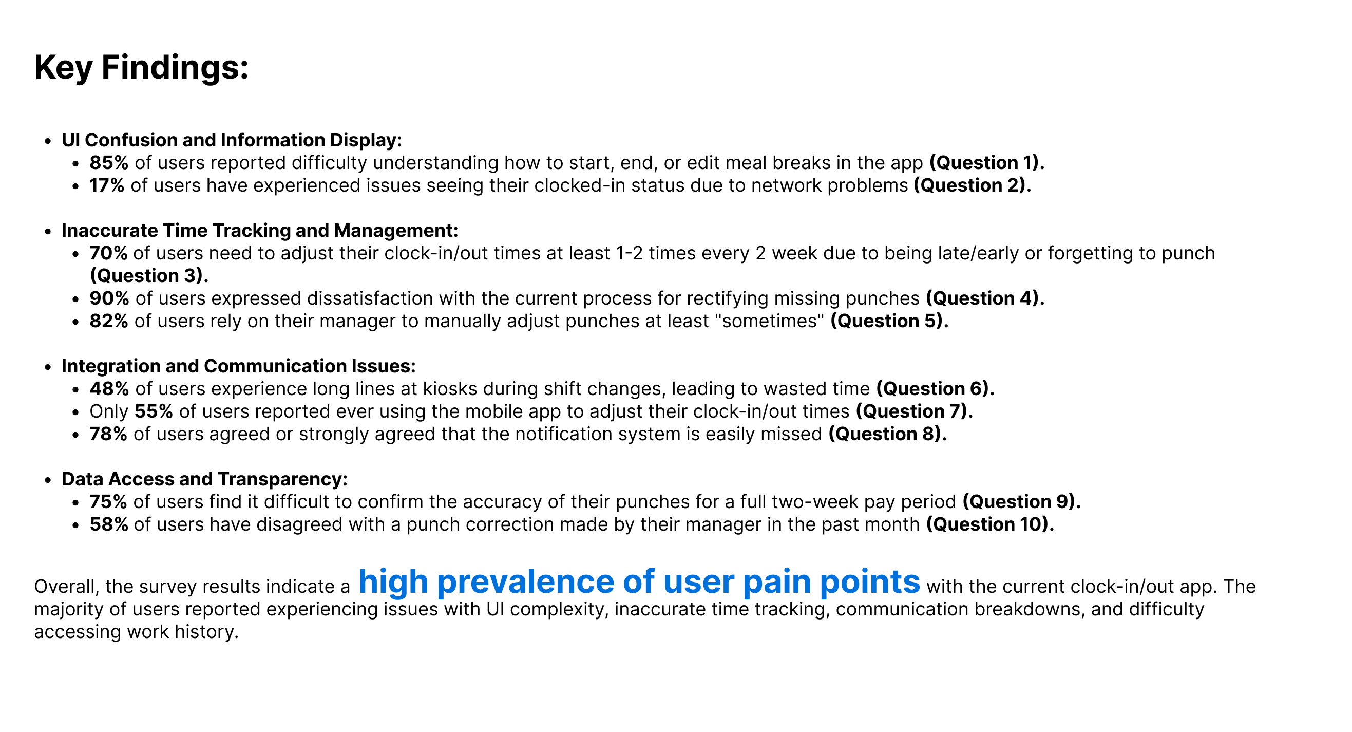
This user-centered approach provided a strong foundation for design decisions, ensuring the final product effectively addressed user needs and pain points. And one thing was evident that the PRD was reflecting only 30% of all the real pain points and was almost like the tip of an iceberg as I suspected.
4. Finalizing Requirements, Metrics, and Initial Roadmap:
Following our initial research phase, which included gathering new insights and utilizing card sorting to categorize similar information, we identified a multitude of user pain points. Each pain point, in turn, revealed numerous associated user scenarios.
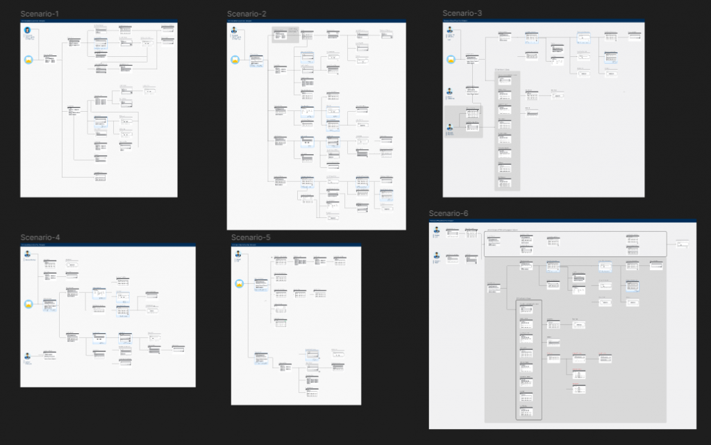
4.1 Building the Process Map/Flow Chart/User Flows:

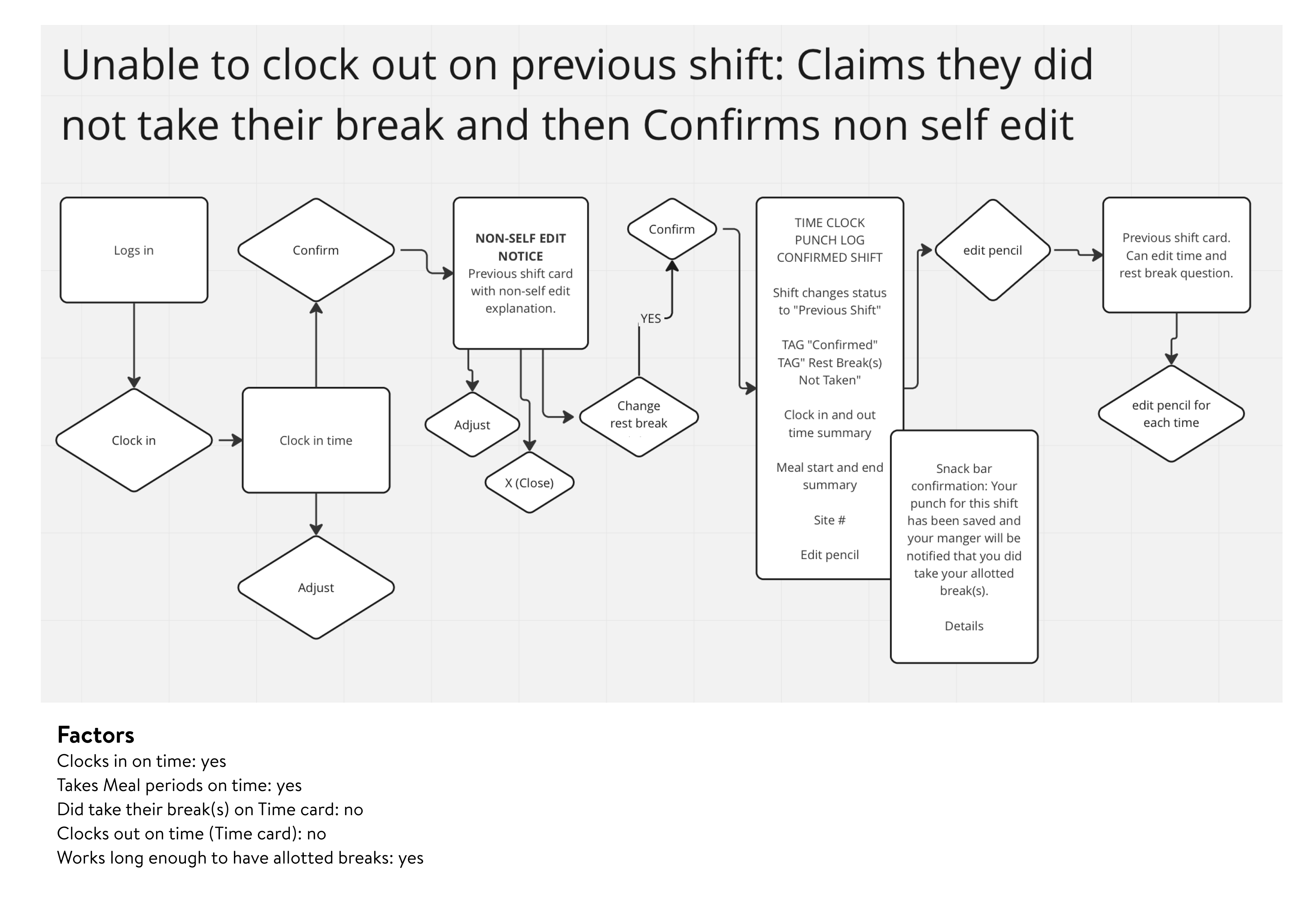
In collaboration with the product team, we aimed to create a comprehensive process map or flowchart. Given the product team’s familiarity with flowcharts, we chose to develop individual flowcharts for each identified user scenario.
4.2 Prioritization and Scoping:
Mapping the flowcharts provided valuable insights for prioritizing critical user flows and gaining a clearer understanding of the project’s scope.
4.3 Metrics Definition:
Leveraging the interview data, we were able to identify relevant “before states” experienced by users. We then incorporated these insights into our survey design, prompting users to record baseline data (e.g., time spent clocking in using existing methods). This data enabled us to propose metrics of interest to the business, such as:
- Hours Saved: Reduced time spent on specific tasks.
- Dollar Saved: Cost savings resulting from process improvements.
- UX Metrics: User experience metrics like Net Promoter Score (NPS) and Customer Satisfaction (CSAT).
4.4 Roadmap Development (Foundation):
The flowcharts provided a foundation for estimating the project’s workload, including the required UX resources. This enabled the creation of a preliminary roadmap outlining the development trajectory.
5. Mobilizing Design Resources in making Persona, Journey Map and Rough Fidelity Prototype:
5.1 Clarity and Confidence:
With a clear understanding of project requirements, scope definition, and minimal risk of scope creep, I transitioned to full-fledged design team engagement.
5.2 Collaborative Design Thinking:
The initial phase involved a dedicated design session. Through brainstorming and discussions, we meticulously crafted a detailed user journey map. This exercise included:
- Persona Development: Defining various user personas as needed, reflecting the diverse user base. This product had mainly one persona,but there were touch points with other persona which we handled in another product.
- Individual Journey Mapping: Creating a specific user journey for each persona, highlighting their unique pain points and emotional states at each stage, informed by interview data.
Image of the initial Journey map we were creating during the design process.

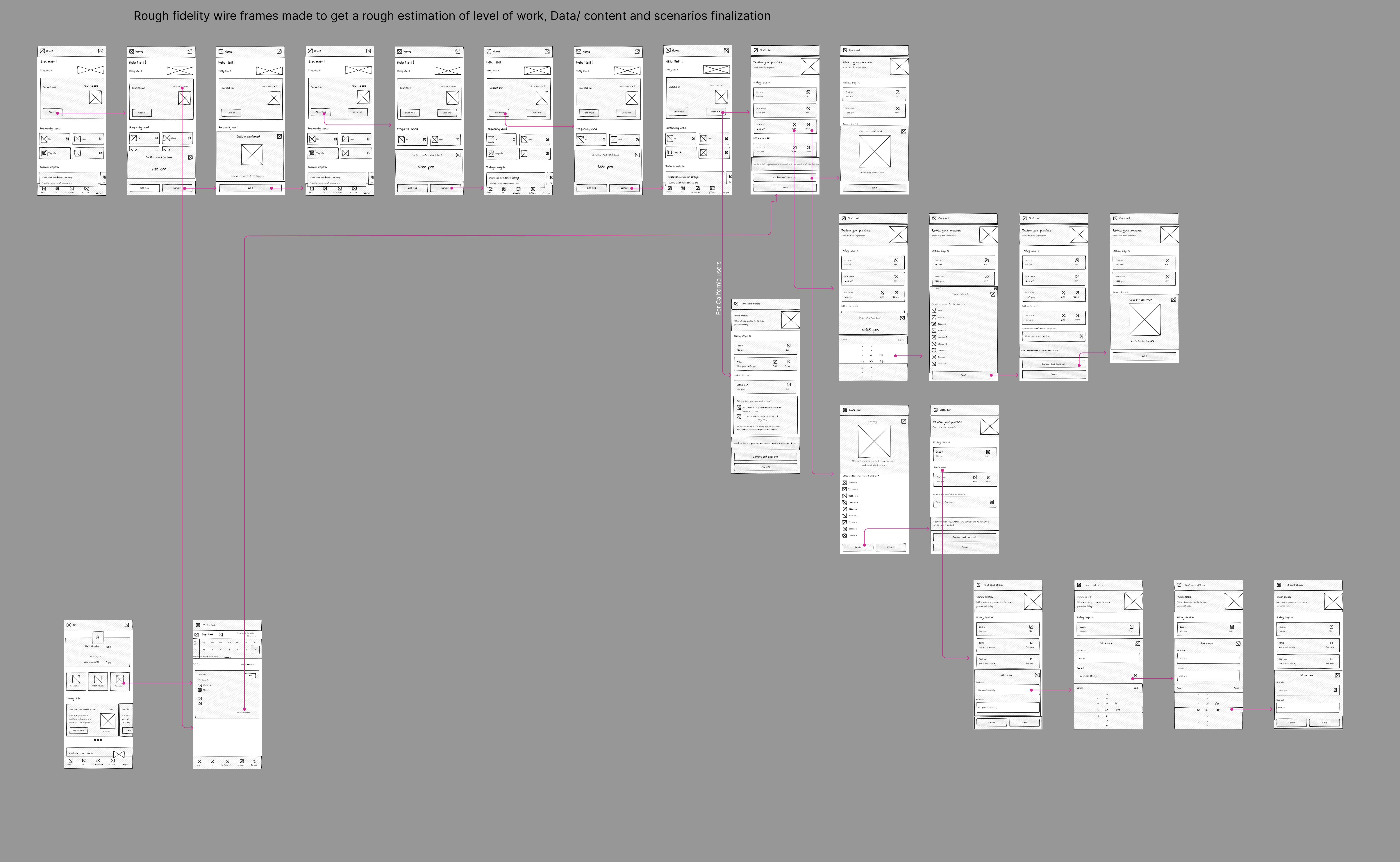
5.3 Leveraging Flowcharts:
Building upon the previously created flowcharts, I employed a unique approach to user journey mapping:
- Rough-Fidelity End-to-End Flow Mapping: Each user scenario was mapped in a rough format, without visuals or data.
Example of end to end rough fidelity mapping (Desktop) - 
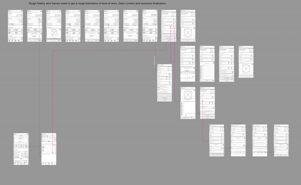
Benefits of this Approach:
- Screen Estimation: This method provided a preliminary estimate of the required number of screens.
- Effort Assessment: It facilitated an initial assessment of design effort needed.
- Roadmap Refinement: Based on the findings, potential roadmap adjustments could be discussed with the product team.
- Content Gathering Context: Rough flows established a context for requesting data and content from product and engineering teams for each screen.
- Agile Delivery Planning: This approach aided in formulating user stories for the Agile board (e.g., Jira).
- UX Deliverable Determination: It helped in defining the scope of UX deliverables.
This comprehensive approach effectively combined user research insights with collaborative design thinking, resulting in a robust foundation for the design phase.
6. Prioritization, MVP Definition, and Initial Feasibility Check
Utilizing rough fidelity prototypes in the early stages of interaction fostered collaboration across teams and yielded significant benefits, as detailed below.
- Alignment Checks: By presenting the early prototypes to stakeholders from Business, Product, and Engineering, we ensured everyone was on the same page regarding the proposed UX direction. Open discussions around the prototypes helped clarify expectations and address potential concerns.
- MVP Prioritization and Definition: Using the rough fidelity prototypes, we facilitated the process of prioritizing and defining user flows and combinations for inclusion in the Minimum Viable Product (MVP). This ensured the initial product focused on the most critical user needs and functionalities.
- Agile Release Planning: The prototypes served as a valuable resource for planning successive releases in the agile development process. They provided a visual roadmap, aiding in the estimation of required features and functionalities for each iteration.
- User Story Refinement: The rough fidelity prototypes enabled us to refine user stories to a granular level, capturing detailed user interactions and expected outcomes. This level of detail ensured clarity and focus throughout the design process.
- Cross-Functional Discussions: Utilizing the prototypes, we sparked open and productive discussions with backend engineers and product managers. This collaboration facilitated the understanding of content needs for each screen and streamlined content creation.
- Backend Considerations: The prototypes informed backend teams about the type of data needed for various functionalities. This early communication helped in assessing feasibility, estimating data availability timelines, and identifying potential API limitations, preventing unnecessary roadblocks later in development.
- Usability Testing and Validation: We conducted usability testing with a group of users to gauge their first impressions of the rough fidelity prototype and assess if we were on the right track. Positive user feedback and excitement about the direction we were taking significantly boosted the motivation of the UX design team.
- Enhanced Roadmap Development: The rough fidelity prototype served as a springboard for more in-depth discussions with the “4IB” (Product, Business, UX, and Tech). By presenting the prototype, we gained valuable insights and feedback, allowing for the development of a more mature and comprehensive roadmap that considered the perspectives of all stakeholders. This facilitated a unified vision and prioritized the features most crucial to the success of the project.
By leveraging rough fidelity prototypes in this collaborative manner, we fostered a shared understanding across all stakeholders, leading to a smoother development process and a more successful product launch.
7. Refining the Design: From High-Fidelity Prototype to Design Handoff
With the high fidelity prototype complete and the MVP and priorities solidified, our design team embarked on the next phase: meticulously refining the individual flows and user scenarios.
Daily Collaboration for Seamless Development:
- Collaborative Deep Dives: Building on the foundation laid in the previous phase, we delved deeper into each user flow and potential scenarios, leveraging all user research data to ensure a comprehensive understanding of user interactions.
- Living Design in Action: We embraced Walmart’s design system, “Living Design,” to streamline the screen design process. Often, a single screen design required multiple meetings with all stakeholders, including Compliance and Legal teams, to ensure adherence to regulations and guidelines.
- Content and Collaboration: To craft the perfect user experience, we closely collaborated with our content writer to ensure the right message and tone were conveyed on each screen. Internally, the UX team held brainstorming sessions for each flow, discussed solutions, and then brought those visions to life through visual design. To broaden our perspective, we also presented designs internally to other team members, seeking valuable design critiques and suggestions.
- Addressing User Pain Points: Throughout the design process, we remained laser-focused on alleviating the pain points identified in our extensive user research findings. This ensured that our designs directly addressed user needs and frustrations, leading to a more positive and efficient user experience.
- Gorilla Testing for Immediate Feedback: To gain immediate user feedback and validate our design decisions, we conducted targeted Gorilla testing sessions. This rapid testing approach provided valuable insights that helped us refine the user experience before development began.
- Shaping the Screens: Informed by collaborative discussions, gathered insights, and user testing results, we meticulously finalized the design of each screen, iteratively refining the visual elements and user experience to deliver a polished and intuitive experience.
Accessible Design Handoff:
-
WCAG Compliance: Our Figma handoff files were meticulously crafted with accessibility in mind. We adhered to WCAG 2.0 standards wherever possible, ensuring users with disabilities could navigate and interact with the design effectively. This included providing alt text for images, using icons with clear visual cues beyond color (e.g., pairing a red warning icon with an alert symbol), and employing proper color contrast. Click here to view the WCAG checklist that I follow
-
Detailed Instructions for Development: The handoff files went beyond visuals. We included clear written instructions for specific screens, particularly for dynamic content sections. For example, instructions might highlight that a section displays “Most Recently Used” items based on user data, guiding the development team to build the appropriate backend logic.
-
Cross-Functional Communication: Our daily routine involved regular check-ins with Product, Tech, and Business stakeholders. We actively gathered essential content details, confirmed technical feasibility with the Tech team, and presented our design decisions to Product and Business for approval, ensuring alignment and buy-in across all parties.
-
Seamless Handoff: Once sign-off was obtained, we created detailed Figma handoff files with clear instructions. These comprehensive files were then transferred to the Tech team for development, facilitating a smooth transition.
-
Proactive Engagement: To foster a collaborative and efficient development process, we actively engaged with engineers throughout the handoff process. We presented our designs, addressed any questions regarding screens, flows, or feasibility, and maintained open communication to ensure a clear understanding and a successful handover.
8. Beyond the Handoff: Ensuring Flawless Execution
While the meticulous design handoff marked a significant milestone, our commitment to the user experience extended far beyond that point. We firmly believe that crafting beautiful and functional designs is only half the battle; ensuring their faithful translation into the final product is equally crucial.
Stepping into the Tester’s Shoes: Anticipating potential deviations, we transitioned seamlessly from designers to specialized testers, forming a dedicated Visual Quality Assurance (VQA) team. This involved meticulously scrutinizing every screen within the live development environment, transforming ourselves into pixel-perfect inspectors.
Unwavering Attention to Detail: Our VQA process commenced with a comprehensive examination of UI elements. From font sizes and padding to responsive behavior (excluding this step due to the React Native platform), every detail was rigorously inspected to ensure precise alignment with our design specifications.
Beyond the Surface: Our testing extended beyond aesthetics, encompassing a thorough evaluation of user flows and edge cases. We meticulously tested empty and error states, meticulously comparing their behavior to the detailed mockups provided in our handoff files. Additionally, we diligently verified the implementation of alt texts for images, upholding accessibility standards.
Collaborative Refinement: Throughout the VQA process, open communication with the development team remained paramount. We promptly communicated any discrepancies identified, working collaboratively to bridge any gaps and ensure the final product mirrored our design vision with unwavering fidelity.
By embracing this proactive approach, we went beyond simply designing the product; we actively participated in its creation, safeguarding the user experience and ensuring a seamless transition from design to development.
Screens and Prototype
Experience the full user journey! Click the button below to see the entire end-to-end flow with a clickable prototype.
What users had to say about this product


