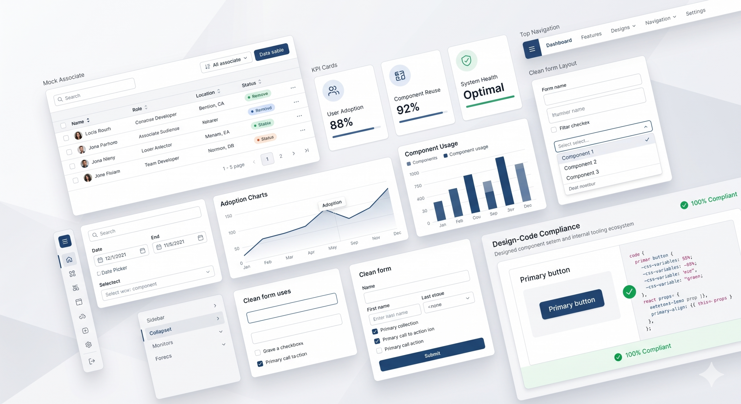
Building reusable components and token-compliant implementation practices across enterprise teams
I led design system strategy for enterprise and associate-facing products by contributing reusable components to Walmart’s Living Design system, creating a new subsystem for internal tools where the existing design language fell short, and building a token-compliant tool that helped teams align design and engineering more consistently at scale.
Role: Senior Manager II, Design & Strategy
Scope: Design systems, reusable components, design-engineering alignment, governance, internal tooling
Team: Design leads, designers, engineers, frontend platform partners
System: Living Design + custom associate-facing subsystem
Impact Snapshot
- 40% reduction in design and engineering rework
- 63% improvement in consistency
- 70% improvement in accessibility compliance
- 67% reduction in QA issues
- Increased adoption of shared components across multiple teams
- Accelerated implementation and reduced duplication across products and repos
Overview
As Walmart’s enterprise product ecosystem expanded, teams across finance, internal tools, and associate-facing products were increasingly solving similar problems in different ways. While Living Design, Walmart’s broader design system, provided a useful foundation, it had largely been built for customer-facing experiences and component-level usage. It did not fully address the workflow, data-density, and operational needs of associate-facing enterprise products.
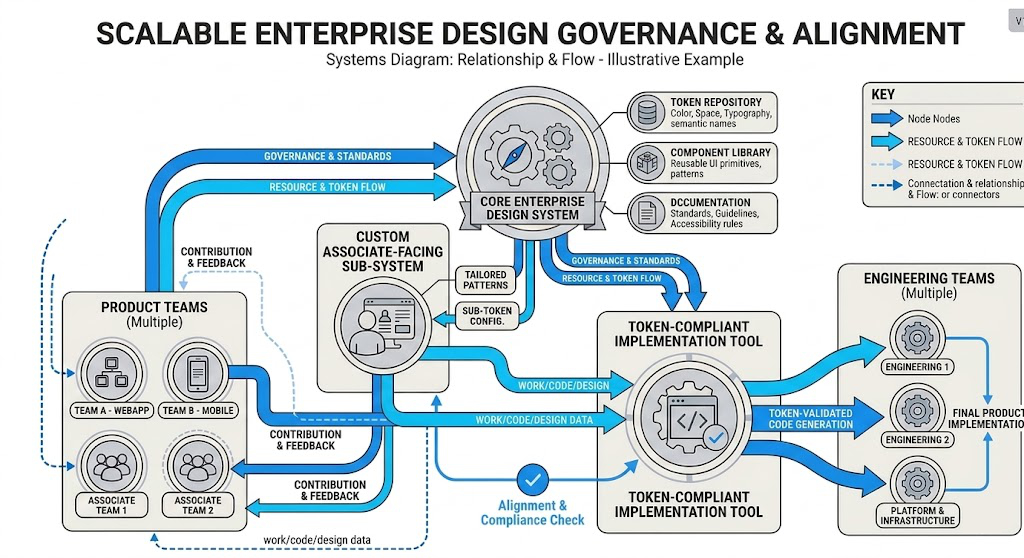
To close that gap, I contributed major data-visualization and finance-focused components to Living Design and led the creation of a new subsystem tailored to internal tools. This included patterns and reusable components designed for the realities of enterprise workflows, where teams needed more than atom-level components — they needed scalable, higher-order patterns that supported speed, consistency, and governance.
In parallel, I helped create an internal token-compliant tool that bridged design and engineering by checking implementation against design tokens, accessibility standards, and Living Design compliance. Together, these efforts improved consistency across teams, accelerated delivery, and reduced implementation drift.
The Strategic Problem
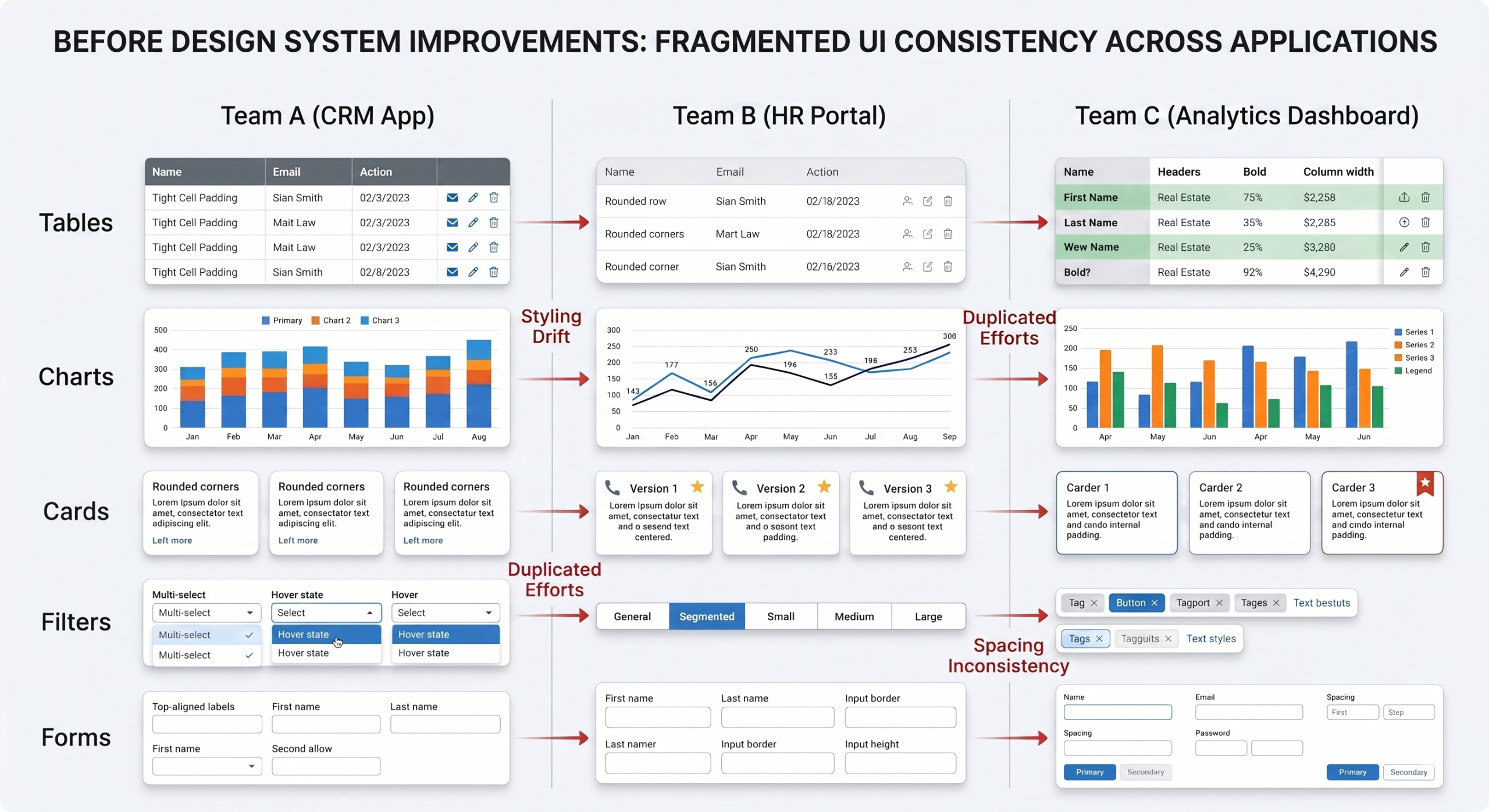
The challenge was not just visual inconsistency. It was an organizational scaling problem.
Across teams, designers and engineers were often interpreting the same needs differently because the existing system operated too close to the atomic component level. In practice, this meant teams were repeatedly recreating similar patterns for tables, charts, filters, cards, KPI modules, alerts, navigation, and forms — often with slight variations that weakened consistency and increased maintenance cost.
Engineering teams frequently rewrote similar code rather than building on shared structures. This led to:
- inconsistent UI patterns across products,
- slower design and engineering velocity,
- implementation drift between design and shipped experiences,
- accessibility gaps,
- larger repos and more code maintenance,
- and difficulty identifying or reusing proven patterns from other teams.
The system also lacked enough support for finance and data-heavy use cases, where internal tools required richer visualizations, denser information layouts, and more specialized interaction patterns than customer-facing products.
This was ultimately a scale problem: how do you maintain consistency, speed, and quality across multiple teams when the system foundation is not fully meeting enterprise needs?
My Role as a Leader
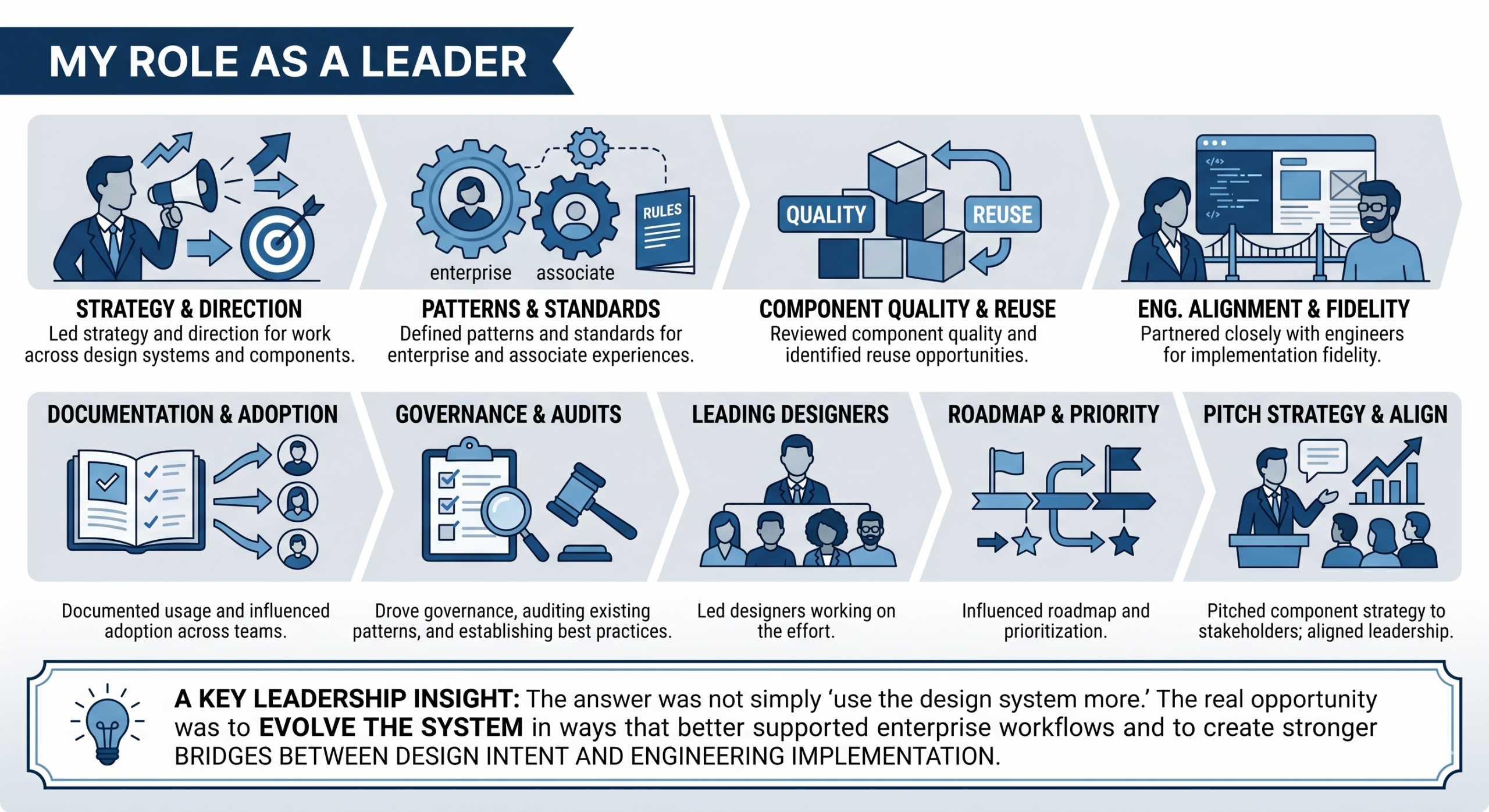
I led the strategy and direction for this work across design systems, reusable components, and design-engineering alignment.
My role included:
- defining patterns and standards for enterprise and associate-facing experiences
- reviewing component quality and identifying reuse opportunities
- partnering closely with engineers to ensure implementation fidelity
- documenting usage and influencing adoption across teams
- driving governance, including auditing existing patterns and establishing best practices
- leading designers working on this effort
- influencing roadmap and prioritization
- pitching the component and tooling strategy to stakeholders
- aligning design, engineering, and leadership around a more scalable approach
A key part of my leadership was recognizing that the answer was not simply “use the design system more.” The real opportunity was to evolve the system in ways that better supported enterprise workflows and to create stronger bridges between design intent and engineering implementation.
Approach
The work happened on two connected tracks.
1. Extending design system support for enterprise use cases
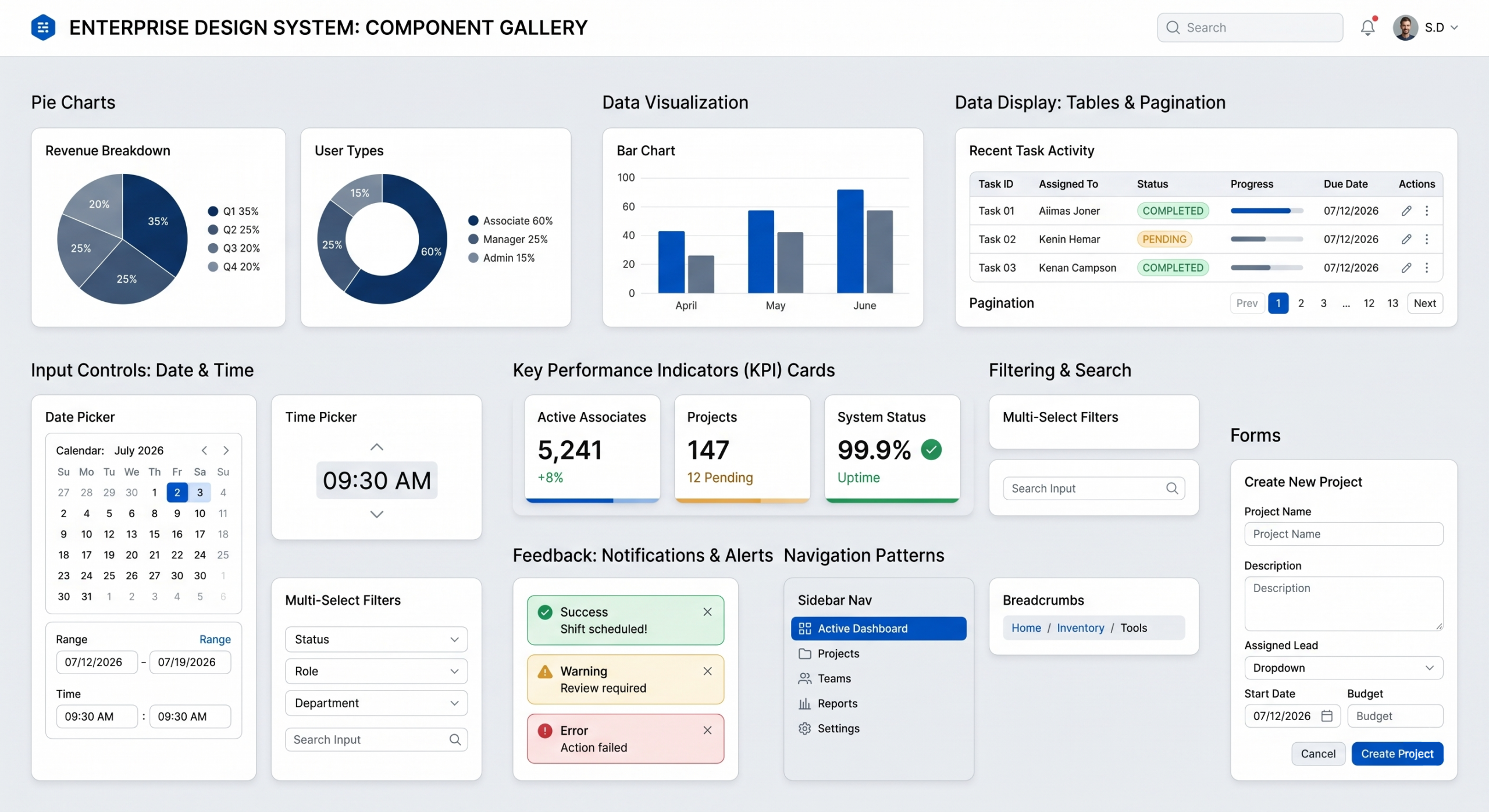
I contributed to Living Design by shaping and refining data-visualization and finance-oriented components such as:
- pie charts
- donut charts
- bar charts
- tabular views
- pagination
- date pickers
- time pickers
- data-visualization tiles / finance cards
At the same time, my team created a broader associate-facing subsystem because Living Design alone did not provide enough support for internal workflows and enterprise patterns. This subsystem included:
- tables
- filters
- cards
- alerts
- KPI modules
- navigation patterns
- forms
- workflow-oriented patterns for enterprise tasks
2. Creating a token-compliant implementation tool
To reduce drift between design and shipped product, I also helped create an internal tool that:
- mapped UI code to design tokens
- translated code into token-aligned components
- audited existing UI against Living Design compliance
- flagged accessibility issues
- identified gaps during visual QA
- provided issue detection and code-level fixes
- supported conversion from existing code toward design-system-compliant implementation
This made it easier for both designers and engineers to work from a shared foundation rather than rebuilding patterns or debugging inconsistencies late in the process.
Key Design and System Moves
Several decisions made this work successful:
Creating a subsystem, not just more components
Instead of forcing enterprise teams to work around a customer-facing system, we created a subsystem that better reflected the realities of associate-facing products and internal workflows.
Moving from atom-level components to more reusable product patterns
Teams did not just need buttons and fields — they needed meaningful patterns at the molecule and workflow level. This made reuse more practical and reduced interpretation drift.
Bridging design and engineering through token-compliance
The internal tool helped turn design system usage from a static guideline into something operational and testable inside real implementation workflows.
Embedding accessibility into the system
Accessibility was not treated as a separate audit layer. It was built into the tooling and component logic so teams could catch and fix issues earlier.
Reducing duplication across teams
By helping teams build on shared patterns instead of recreating them, we improved speed, consistency, and maintainability at the same time.
Outcome
The impact of this work extended beyond individual components.
By contributing to Living Design, creating a subsystem for associate-facing products, and introducing a token-compliant implementation tool, we improved both the quality and scalability of enterprise design delivery.
The results included:
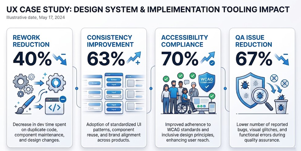
- 40% reduction in design and engineering rework
- 63% improvement in consistency
- 70% improvement in accessibility compliance
- 67% reduction in QA issues
- faster implementation across teams
- greater reuse of shared patterns
- reduced duplication in engineering repos
- stronger alignment between design intent and shipped product
Perhaps most importantly, this work helped shift design systems from being seen as a static library into something more operational: a shared quality framework that improved speed, consistency, and collaboration across teams.
What I Learned
This work reinforced that design systems are not just component libraries — they are organizational tools for scaling quality.
A strong system is not only about consistency in visuals. It is about reducing rework, improving collaboration, increasing implementation confidence, and helping teams move faster without fragmenting the experience.
It also reinforced that system work requires leadership judgment. Teams often need both governance and flexibility, and the role of design leadership is to create a model that supports both. In this case, the combination of subsystem thinking and token-compliant tooling helped create a more practical bridge between design ambition and engineering reality.