Overview
MyTech was Walmart’s internal support entry point for associates who needed devices, accessories, apps, licenses, or help resolving technology issues. In theory, it should have worked like a one-stop support experience. In practice, it was anything but.
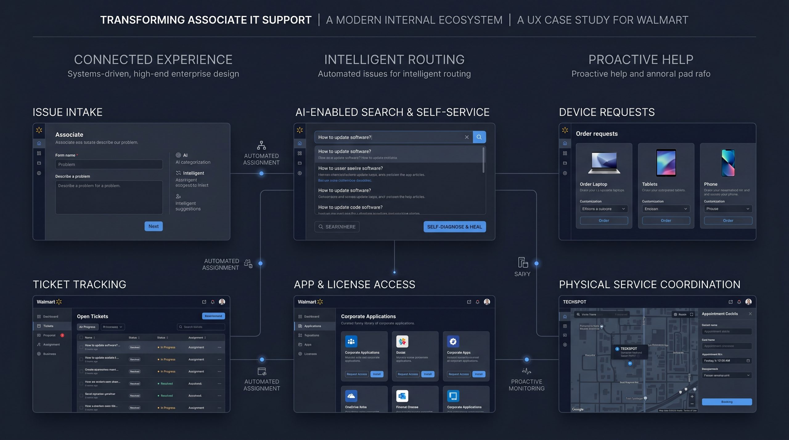
Associates could request a laptop in one place, create a ticket somewhere else, track status through ServiceNow, visit TechSpot in person for hardware issues, and use separate systems again for apps and license requests. Even the knowledge behind support was fragmented—spread across different libraries, annual PDF documents, disconnected repositories, and technician-specific workarounds that were not shared consistently across teams.
I led a research-driven redesign of this ecosystem to make support easier to access, easier to understand, and easier to resolve. The goal was not simply to improve usability. It was to stop making associates decode the support system, reduce avoidable friction, and shift the burden of correctness away from users and back into the product and support infrastructure itself.
The Strategic Problem
The biggest issue with MyTech was not that it looked outdated. It was that the support journey had no real center of gravity.
Associates often did not know where to go when something broke. Should they start in MyTech? ServiceNow? TechSpot? Different parts of the support journey lived in different places, but they did not behave like one connected system.
A typical experience looked like this: request a device in one interface, receive a ticket number through ServiceNow, then log into a separate area later just to check status—with no clear sense of progress beyond generic ticket updates. There was no equivalent of a real-time order tracker, no unified support timeline, and no confidence that the request was actually moving.
The same fragmentation showed up across the ecosystem:
- app and license requests happened in other tools,
- ticket status lived outside the main experience,
- common issues were hard to categorize correctly,
- and support knowledge was distributed across different libraries, static documents, and even annual PDFs.
Technicians often relied on tribal knowledge or personal scripts that were not available to the broader support organization. Some issues could be solved quickly if the right person knew the workaround; others took far longer simply because the knowledge was inconsistent, hidden, or not operationalized.
Issue intake made things worse. Categories were often too generic, too technical, or too limited, so associates selected whatever seemed closest. Every issue created a separate ticket—even when the user was really dealing with multiple related problems. That meant the system pushed too much responsibility onto the user to diagnose, classify, and structure requests correctly.
What followed was predictable: wrong routing, duplicate tickets, wrongly closed issues, manual reassignment, support escalations, and too much unnecessary work for L1 and customer care teams.
This was not just a front-end usability problem. It was a broken support ecosystem where fragmented intake, rigid platform constraints, disconnected workflows, and operational silos created friction at every stage.
My Role as a Leader
I led UX strategy for the redesign and was responsible for shaping the work from research through prioritization, concept development, and stakeholder alignment.
My role included:
- leading the overall design direction,
- managing designers working on the initiative,
- directing research and synthesis,
- presenting findings and recommendations to stakeholders,
- driving prioritization and roadmap decisions,
- and helping teams align around a simpler and more scalable support model.
I worked closely with Product, Engineering, IT support, Operations, business stakeholders, and leadership across a system with many owners but no single coherent experience. A key part of my role was helping teams stop thinking in isolated workflows—device requests, app access, ticket creation, TechSpot visits, service status—and start seeing support as one connected journey.
The work was not just about making screens better. It was about redesigning how support worked across a fragmented ecosystem and shifting the experience from reactive problem handling to smarter, more proactive support.
Stakeholder Alignment
This initiative involved Product, Engineering, IT support, TechSpot-related service teams, Operations, business stakeholders, and leadership. Because support workflows were spread across multiple systems and operational owners, alignment was not straightforward.
There was pushback from several directions:
- engineering complexity,
- ServiceNow constraints,
- support process ownership,
- and the fact that different business groups controlled different parts of the ecosystem.
ServiceNow in particular was a major constraint. It was not designed around Walmart’s full support complexity, and changes there were often slower and harder to implement than changes made in adjacent product layers. In many cases, it was faster to improve the experience in our own product than to rely on deep ServiceNow customization.
Research became the strongest alignment tool. Instead of discussing abstract improvements, I used user observation, workflow analysis, and usability findings to show where associates were getting stuck, where support teams were absorbing preventable manual work, and where the system itself was creating failure.
That helped stakeholders align around a clearer set of priorities:
- give users one clearer place to start,
- improve issue intake upstream,
- reduce routing failures,
- improve visibility into progress,
- connect digital and physical service workflows,
- and create more intelligence before issues reached support teams.
Approach
The work began by studying the support experience as a real operational system, not just a ticketing flow.
We used a combination of:
- shadowing,
- interviews,
- contextual inquiry,
- workshops,
- design thinking sessions,
- usability testing,
- surveys,
- qualitative and quantitative analysis,
- and iterative validation.
One of the clearest research themes was that people did not know where support began or ended. Users were confused by multiple entry points and did not know whether to go to MyTech, ServiceNow, TechSpot, or all of the above. Tickets created in ServiceNow did not clearly surface inside MyTech, which made the experience feel even more fragmented.
The goal became much clearer: design a support model that felt like one system, improve intake so users did not need to think like support agents, make progress more visible, strengthen self-service, and reduce the amount of avoidable work caused by poor structure upstream.
Key Design Moves
One clearer support entry point
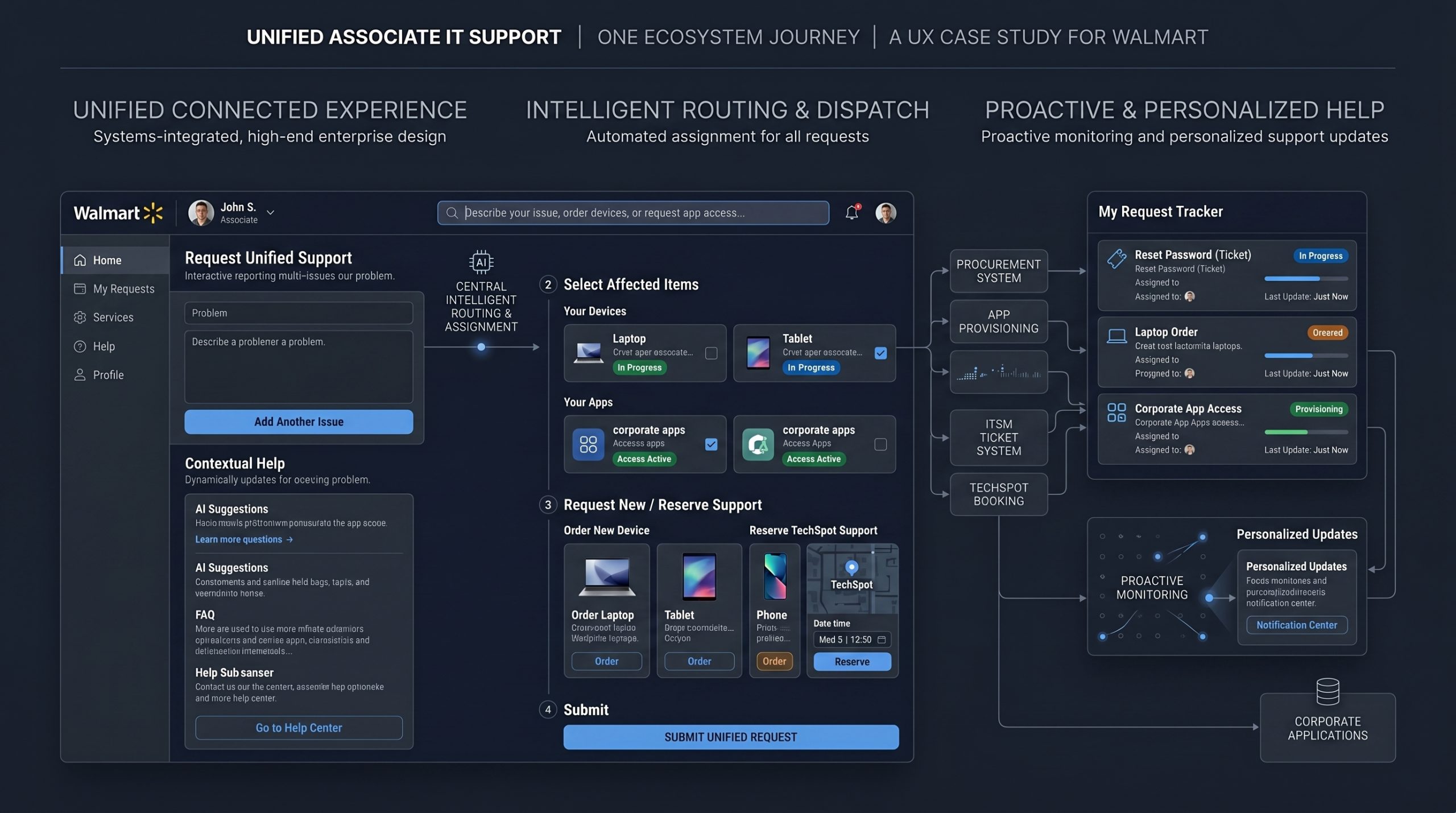
The redesign moved the experience closer to what users expected intuitively: one place to request devices, access apps and licenses, create support requests, and track issues without needing to understand which internal system owned what.
Single multi-select issue capture
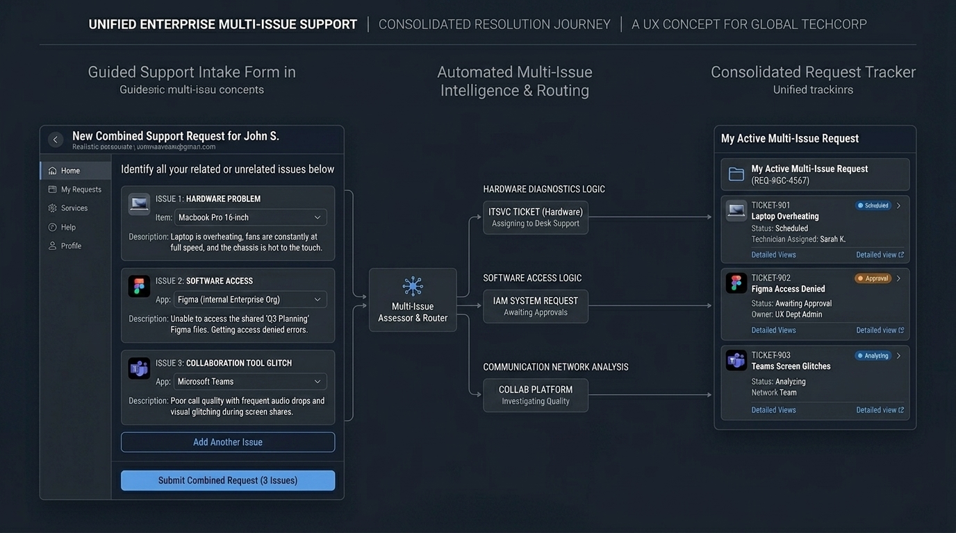
One of the biggest structural problems in the old experience was that every issue created a separate ticket, even when a user was really dealing with multiple related problems. We redesigned intake so associates could select multiple issues in one guided flow rather than starting over again for each one.
For example, a user dealing with a Figma issue, a glitching Teams app, and an overheating laptop could report everything in one place instead of creating separate tickets for each issue. This reduced duplicate tickets, made issue reporting feel more natural, and gave support teams a better picture of the overall problem upfront.
Smarter issue capture with less guesswork
We redesigned issue intake so associates no longer had to decode technical categories or choose between vague options. Clearer language, better structure, and improved guidance helped users describe real problems more accurately.
More importantly, we shifted the burden of correctness away from users. Instead of expecting people to classify their issue perfectly, the system became more responsible for understanding what the problem was and where it should go.
Auto-routing using agent support
We introduced routing intelligence that could interpret free text and voice-to-text inputs and direct issues to the right team. This reduced avoidable misrouting, cut down on manual reassignment, and improved support accuracy much earlier in the process.
AI-enabled search and self-resolution
We connected search more intelligently to the knowledge ecosystem so users could find relevant answers faster, resolve common problems on their own, and reduce unnecessary dependency on support agents.
Proactive self-diagnose and self-heal
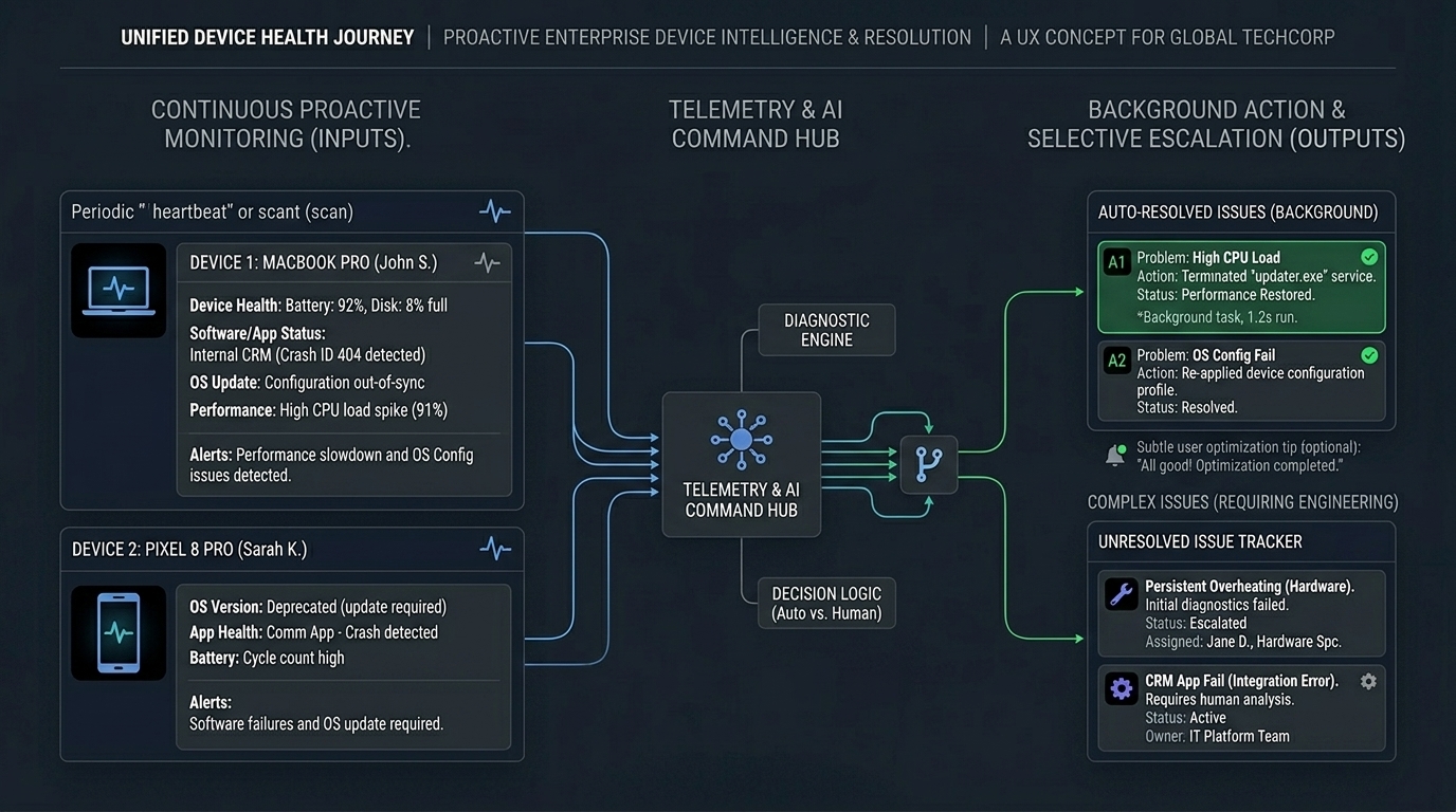
In partnership with the telemetry team, we also designed a more proactive support model. Devices were checked at regular intervals and their health signals were sent to a telemetry command hub we helped design. This covered a range of issues, including device health, software and app failures, configuration issues caused by OS updates, and performance slowdowns.
The command hub could then run scripts and automated fixes in the background—often resolving problems before the user even knew something was wrong. In some cases, we used scripts to detect and close unnecessary running applications to improve device performance, while notifying users through lightweight popups.
If the issue could not be resolved automatically, it was routed to the right engineering team, a ticket was created, and the user was notified. This shifted the support model from reactive to proactive and reduced overall ticket volume by 20%.
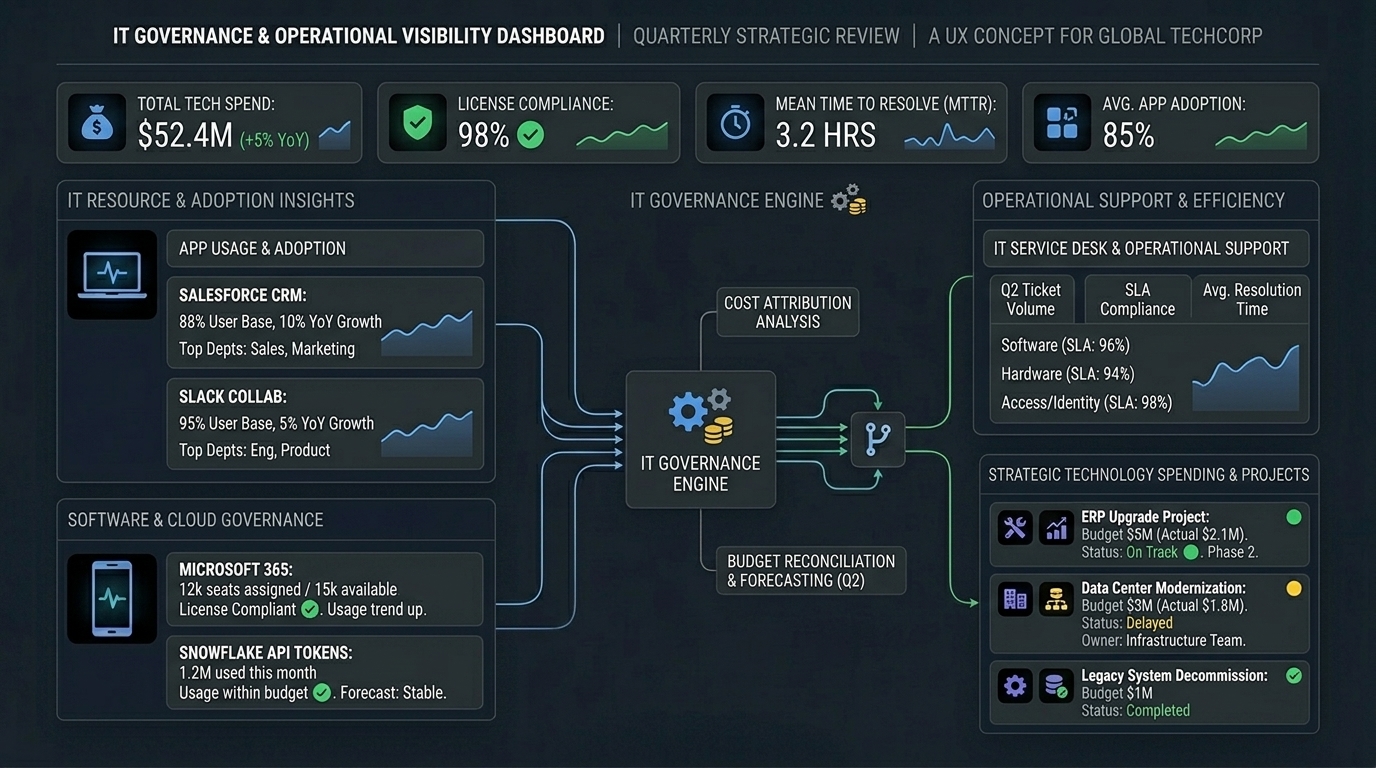
Better visibility into status and progress
Tracking a device request or support case should not have required decoding ticket updates inside ServiceNow. We worked to make status more visible and understandable inside the main experience so users had a clearer sense of progress instead of just a case number.
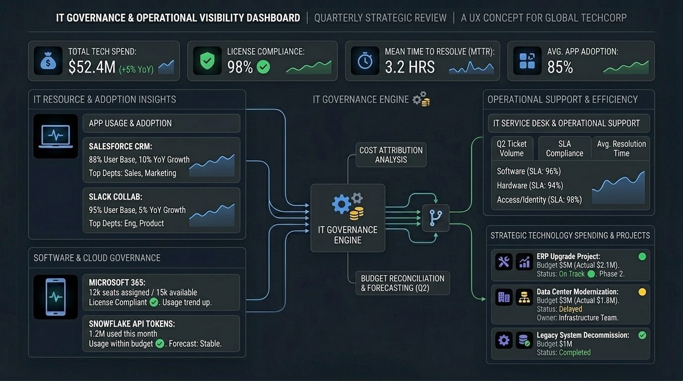
Connected service touchpoints
Support did not end with digital ticketing. Physical service models like TechSpot also had to be accounted for. The redesign included support for better reservation and service coordination so digital and in-person service felt less disconnected.
Governance and operational visibility
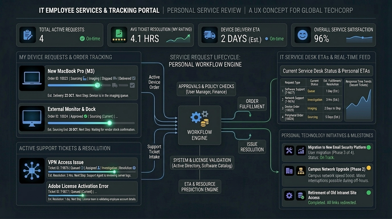
We also brought governance-related capabilities closer to the product experience, including app and license management, re-licensing, and dashboards showing license usage, token usage, app adoption, team budgets, and spend visibility. This pulled operational intelligence out of disconnected experiences and made the system more actionable for both users and leadership.
Governance and operational visibility
We also brought governance-related capabilities closer to the product experience, including app and license management, re-licensing, and dashboards showing license usage, token usage, app adoption, team budgets, and spend visibility. This pulled operational intelligence out of disconnected experiences and made the system more actionable for both users and leadership.
Outcome
The redesign improved both the associate experience and the support system behind it.
For users, MyTech became easier to understand, easier to navigate, and easier to trust. People no longer had to guess as much, jump between systems as often, or rely entirely on support teams to untangle requests that should have been structured correctly from the start.
For support teams, the benefits were equally significant. Better intake, more accurate routing, improved self-service, clearer status visibility, and proactive self-healing reduced avoidable manual work and made the ecosystem more scalable.
Measured impact included:
- NPS increased from 30 to 84
- Task completion improved by 57%
- Escalations were reduced by 89%
- Adoption increased by 73%
- Support team efficiency improved by 82%
- Resolution effort decreased by 3 hours per user
- Ticket volume reduced by 20% through proactive self-diagnose and self-heal
More broadly, the redesign moved MyTech closer to what it should have been all along: a one-stop support experience for devices, apps, licenses, and issue resolution—with far less need for users to understand the architecture behind it.
What I Learned
This work reinforced that the biggest problems in enterprise support usually live in the seams between systems, not just in the screens themselves.
Users were not failing because they lacked effort. They were failing because the system expected them to understand internal structures, ownership boundaries, and support logic that should have been invisible to them.
It also reinforced that weak intake makes everything downstream more expensive. Poor categorization, weak routing, hidden knowledge, and disconnected status visibility do not just frustrate users—they multiply effort across support operations.
The most valuable part of this redesign was not just making the interface cleaner. It was shifting more responsibility from the user to the system: making support smarter about intake, better at routing, more visible in progress, and increasingly proactive in resolving issues before they became tickets.